From Messy Dataset to “At-a-Glance” Visualizations of Competitive Landscape
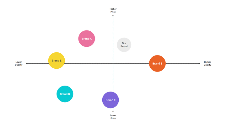 Image Credit: [moqups.com]
Overview
As AI and automation accelerated across the industry, my stakeholders need to understand the competitive space of AI, automation, and technology in title/settlement platforms. The challenge wasn’t collecting information—it was making complex, uneven competitive data understandable and actionable for decision-makers.
This case study focuses on how I translated a large competitive dataset into a clear visualization system. It intentionally avoids sharing competitive “insights” or conclusions about specific companies.
The Business Problem
Leadership needed decision support for product strategy questions, like:
Where are competitors investing in automation across the transaction workflow?
What types of solutions exist (end-to-end platforms vs. narrow tools)?
Which parts of the ecosystem are truly comparable to our context?
To answer these, stakeholders needed a landscape they could trust and interpret quickly—without reading a long report.
The Research Challenge
This was not a clean comparison set. The competitive space had three structural issues:
1. “Apples-to-oranges” offerings
Some products are broad workflow platforms. Others specialize in one slice (e.g., document automation, search, closing coordination, post-close). Comparing them on a single axis would oversimplify and mislead.
2. “AI” claims were inconsistent
Many vendors used similar language (“AI-powered,” “automation,” “intelligent workflow”), but the underlying capability varied widely. The dataset needed a way to separate marketing terms from meaningful maturity indicators.
3. Too much information to be usable
Raw competitive research often becomes a dense spreadsheet that only the researcher can navigate. Stakeholders needed clarity at a glance, with enough structure to support follow-up questions.
My Role
I led the work end-to-end across:
Research framing (what decisions the landscape needed to support)
Data modeling and taxonomy creation (how we normalized inconsistent inputs)
Classification logic and decision rules
Information design and visualization system
Stakeholder alignment through iterative readouts and refinement
What Success Looked Like
We defined success as a set of outputs that were:
Strategic: tied to product decisions, not just market description
Trustworthy: classification logic visible and repeatable
Scannable: usable in seconds, not minutes
Multi-dimensional without being messy: complexity represented through a system, not a single overloaded chart
Reusable: designed as an artifact we could update as the market changed
Process: From Research Needs to Visualization System
Step 1: Translate stakeholder questions into “decision views”
Before making any visual, I reframed stakeholder needs into explicit questions the landscape must answer:
Orientation question: “Where does each solution fit in the workflow?”
Capability question: “How advanced is automation/AI—and how broadly does it apply?”
Context question: “Which solutions are actually relevant to our domain focus?”
Ecosystem question: “What’s plug-and-play vs. what changes switching costs and integration realities?”
This step prevented a common failure mode: building one beautiful chart that answers none of the real decisions.
Step 2: Build a classification model to normalize messy data
To compare uneven offerings, I created a shared taxonomy—essentially a “data contract” for the landscape.
What we standardized (examples)
Primary workflow focus: where the product anchors its value (even if it touches multiple steps)
Workflow breadth: narrow point solution → broad end-to-end platform
Automation mechanism: rules-based automation vs. AI-driven vs. hybrid
Integration posture: standalone tool → integrated suite → ecosystem
Domain relevance: relevance based on transaction complexity and operational needs (rather than vendor labels)
The key: explicit decision rules
I documented rules for edge cases, such as:
Platforms spanning multiple workflow stages
Suites that bundle unrelated modules
Tools that market “AI” but primarily deliver rules-based automation
Products that appear comparable but serve fundamentally different transaction contexts
This turned subjective categorization into something stakeholders could understand, challenge, and trust.
Step 3: Choose a “backbone” view for orientation
I started with Workflow Stage because it matches how most stakeholders naturally reason about real estate closing: as a lifecycle with handoffs and dependencies.
Why this came first
It gives immediate context to non-experts: “Where in the process does this help?”
It avoids premature ranking or “winners/losers”
It makes later views easier to interpret by grounding them in a shared mental model
Design principle: Always orient before differentiating.
Step 4: Avoid the single 2×2 trap—use complementary, orthogonal views
A single chart can’t responsibly represent a market where:
some products are broad platforms,
some are specialized,
and “AI” is not consistently defined.
So I designed a system of four views, each answering a different strategic question with minimal cognitive load.
The Solution: A Four-View Competitive Landscape System
1. Workflow Stage Landscape
Question answered: “Where does each solution primarily contribute within the closing workflow?”
**Why it works:**It helps teams understand the ecosystem without needing domain expertise. It also prevents false comparisons by showing that many solutions aren’t trying to solve the same problem.
How it’s designed for clarity:
Grouped by workflow stages with short “expectations” per stage (what buyers typically look for there)
A dedicated representation for cross-lifecycle platforms so multi-stage tools don’t distort stage-specific comparisons
2. AI & Automation Maturity × Workflow Breadth
Question answered: “How mature is automation/AI—and how broadly does it apply across the workflow?”
**Why it works:**This separates two things stakeholders often conflate:
maturity of automation capability
how much of the workflow the product claims to cover
How it’s designed for responsible interpretation:
“Maturity” is grounded in observable capability indicators rather than marketing terms
“Breadth” is framed as workflow ownership, not simply feature count
Design principle: Keep axes orthogonal so the chart stays truthful.
3. Commercial vs. Residential Relevance
Question answered: “Which solutions are most comparable to our operational context?”
**Why it works:**Transaction types differ in complexity, documentation, risk, and workflow variability. Without this lens, stakeholders may draw incorrect strategic conclusions from superficially similar tools.
How it’s designed:
A simple segmentation that scopes interpretation rather than ranking vendors
Helps stakeholders quickly identify “directly relevant” vs. “adjacent signals” in the market
4. Ecosystem Integration Landscape
Question answered: “What’s a tool we can plug in vs. an ecosystem that changes interoperability and switching costs?”
**Why it works:**Integration posture shapes adoption dynamics: procurement, implementation effort, dependency risk, and long-term flexibility.
How it’s designed:
Clear categories that highlight whether a solution is:
a standalone product,
part of an integrated suite,
or operating as an ecosystem strategy
Design principle: Strategy isn’t only about features—it’s about constraints.
Making It Usable: Storytelling and Stakeholder Alignment
Progressive disclosure (how the readout was structured)
I presented the work like a product narrative:
Start with workflow stage to establish orientation
Move to maturity × breadth to discuss capability patterns
Add relevance to prevent misinterpretation
End with ecosystem integration to connect to strategic leverage and constraints
This sequence reduced debate and increased clarity: stakeholders could follow the logic rather than getting stuck on definitions.
Built-in “how to read” guidance
Each view includes lightweight framing—axis definitions, category labels, and reading cues—so the landscape can stand alone without the researcher in the room.
Outcomes
This work created an artifact stakeholders could actually use:
A shared vocabulary for discussing a fragmented market
A trustworthy classification model that made comparisons feel grounded
A decision-ready visualization system that supported strategy discussions without requiring deep domain knowledge
A framework designed to be maintained and updated, not a one-time research dump
(Deliberately omitted here: any market-specific conclusions or vendor evaluations.)
What This Demonstrates
This project is a snapshot of the kind of UX work that sits at the intersection of:
research strategy (defining what must be true to make a decision),
analytics and synthesis (normalizing messy inputs),
information design (reducing cognitive load),
and stakeholder alignment (building shared understanding through clear frameworks).
Key Takeaways I’d Reuse
Start with the decisions, not the data.
Normalize first; visualize second.
Use multiple simple views instead of one complex chart.
Make classification rules explicit so the work earns trust.
Design for scanning—then support deeper follow-up.